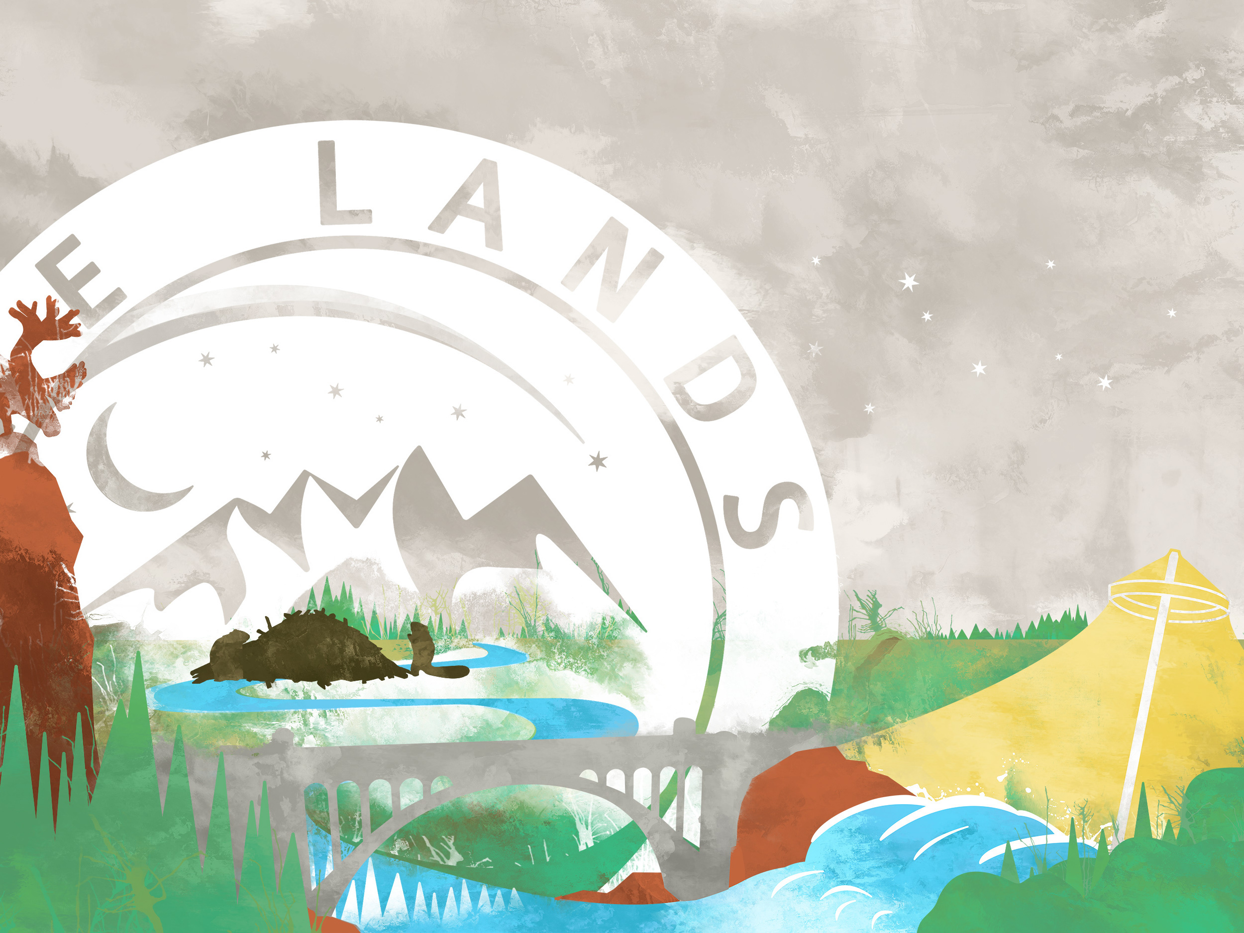
Eat the land
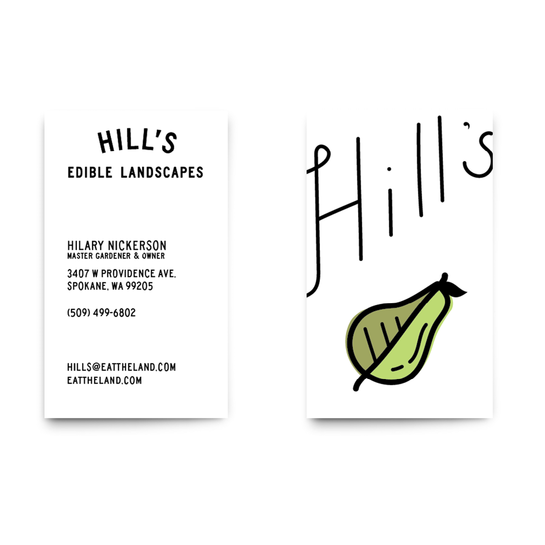
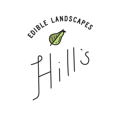
Hill’s existed in a rather difficult market to identify at the time because it wasn't exactly a landscaping service nor was it a traditional gardening service. It needed to identify with the same traditions as a local gardener and still communicate the duality of what Hill's offers.
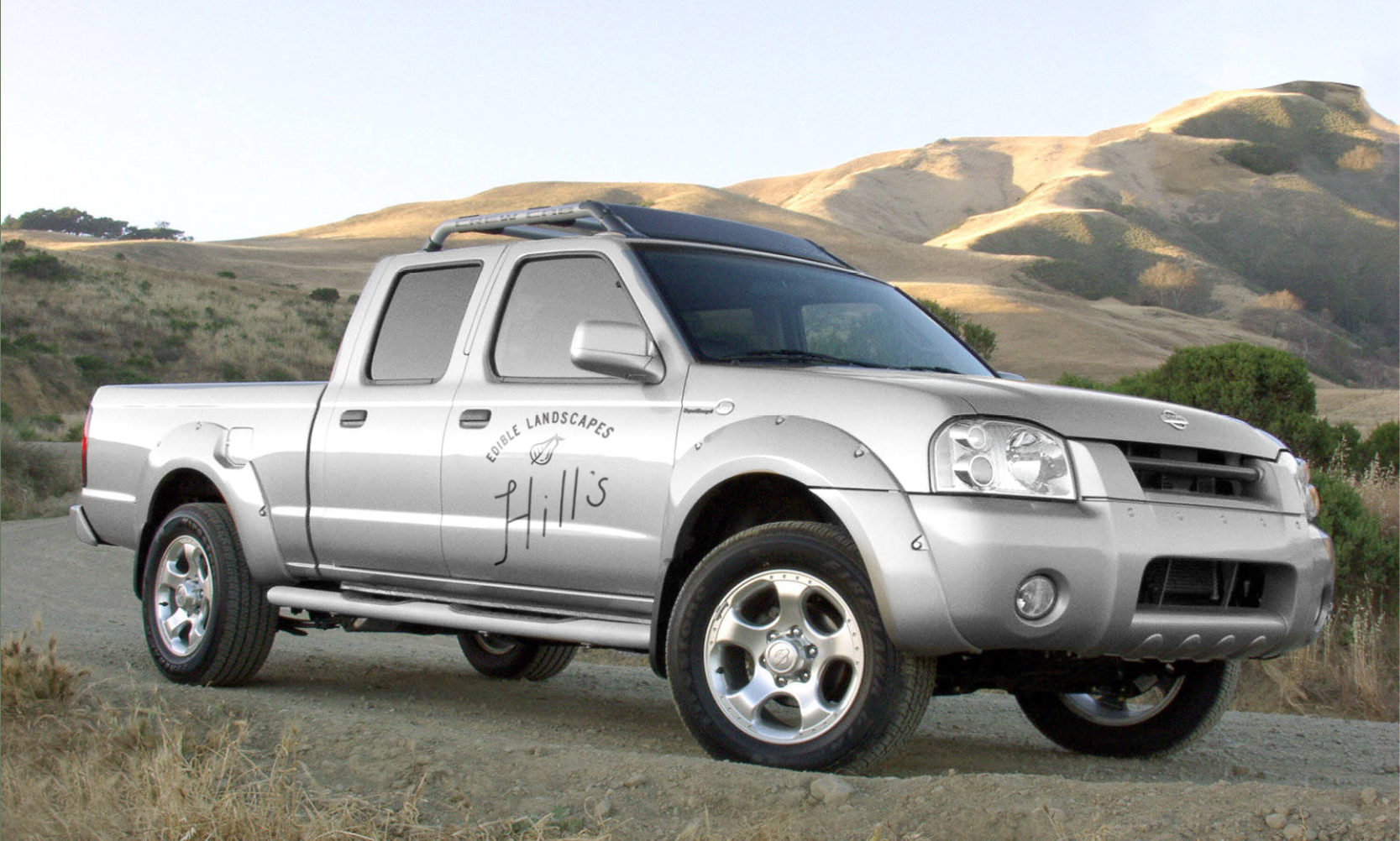
For the word mark, the hand lettered treatment, which I tend to avoid using unless it only makes sense, has found a home in “Hill’s” to let people know that what Hill's does is work of the hands- a craft (in the traditional sense) and that it was a home grown/local service.
The website was done through Squarespace, allowing the client to update when necessary while being a more affordable option as well. We provided services in helping the client find the right name for the business as well come up with an appropriate website address. The address acts as a sort of tagline: Eattheland.com
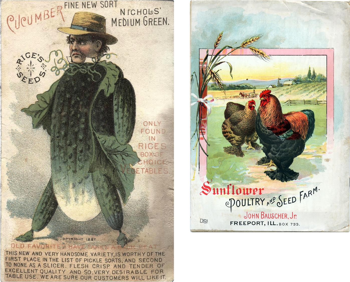
The type treatment influence was taken from old seed/flower packets and advertisements.


The upward movement of the text is something chosen for its feeling of tradition in lawn and landscape services.