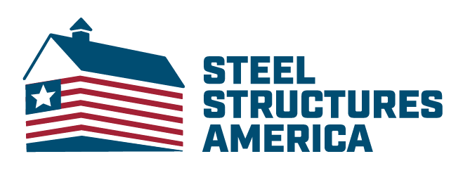
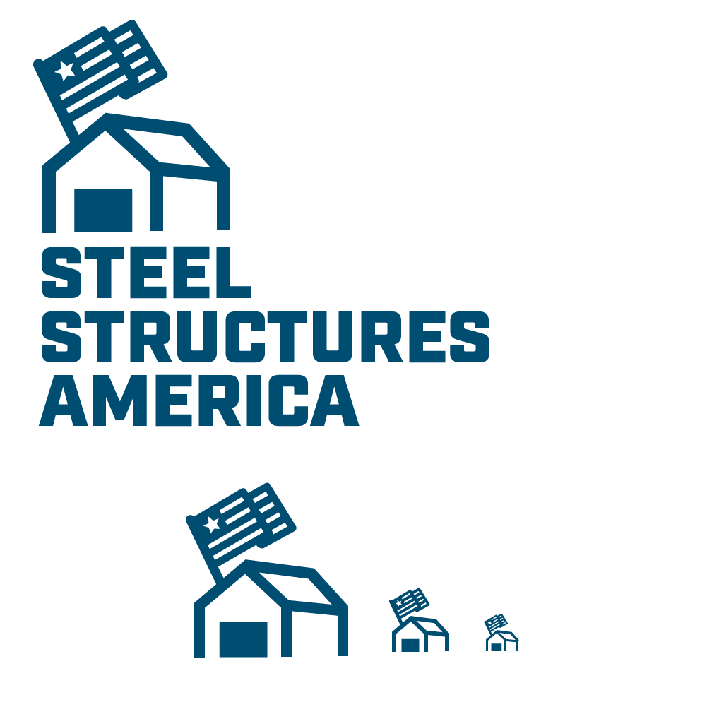
Steel Structures (with "We love it, but we want more America in the logo.")
Steel Structures America was a contracted project through Consistent Hits (handling web development and logistics). Geodesicworks was tasked with creating a visual identity and website mockup for SSA. Research was done jointly with previous work done by Sixth Man Marketing in order to address UI/UX for proposed website. Identity (featuring some of the alternatives) were requested to be based around a patriotic "structure" design. It was my intention to communicate the desired sense of patriotism while not distracting from what the company actually does. The original color palette was for a copper orange (approved for and used in the website) and a navy blue. The full red, white and blue logo was suggested by the contracting company. Alternate logos are also showing below.
An additional logo was included as part of this package for an SSA partner company called Perma-Column. This is included at the very bottom.
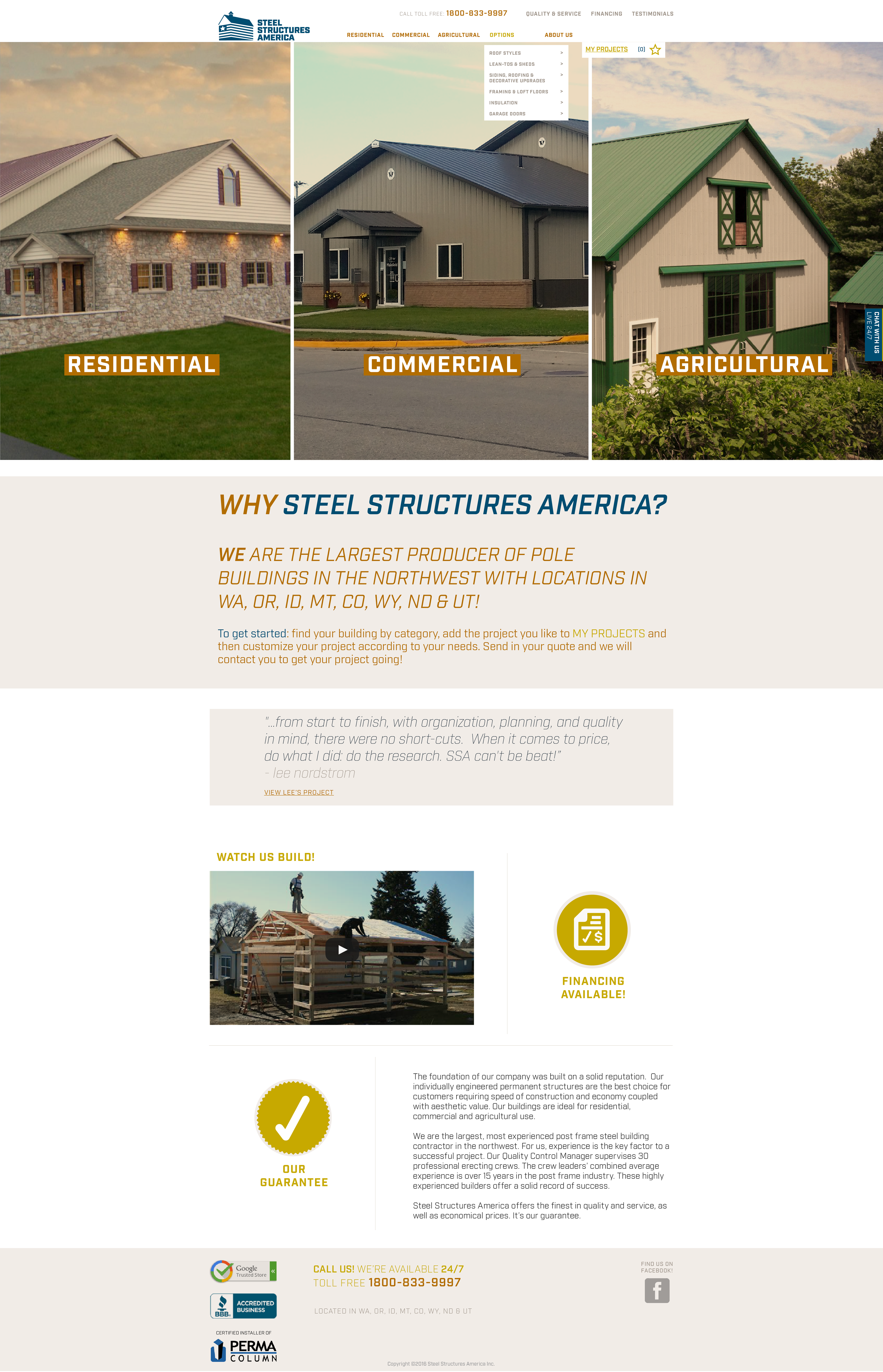
Home page design.
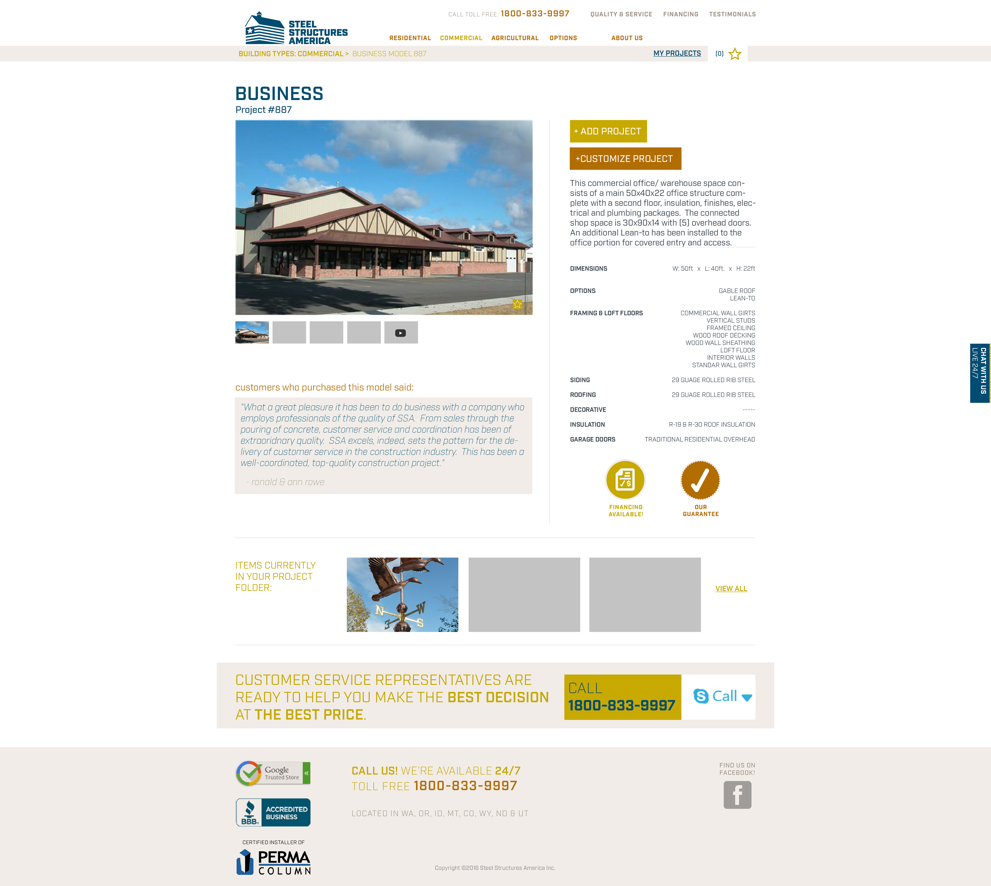
Product page design.
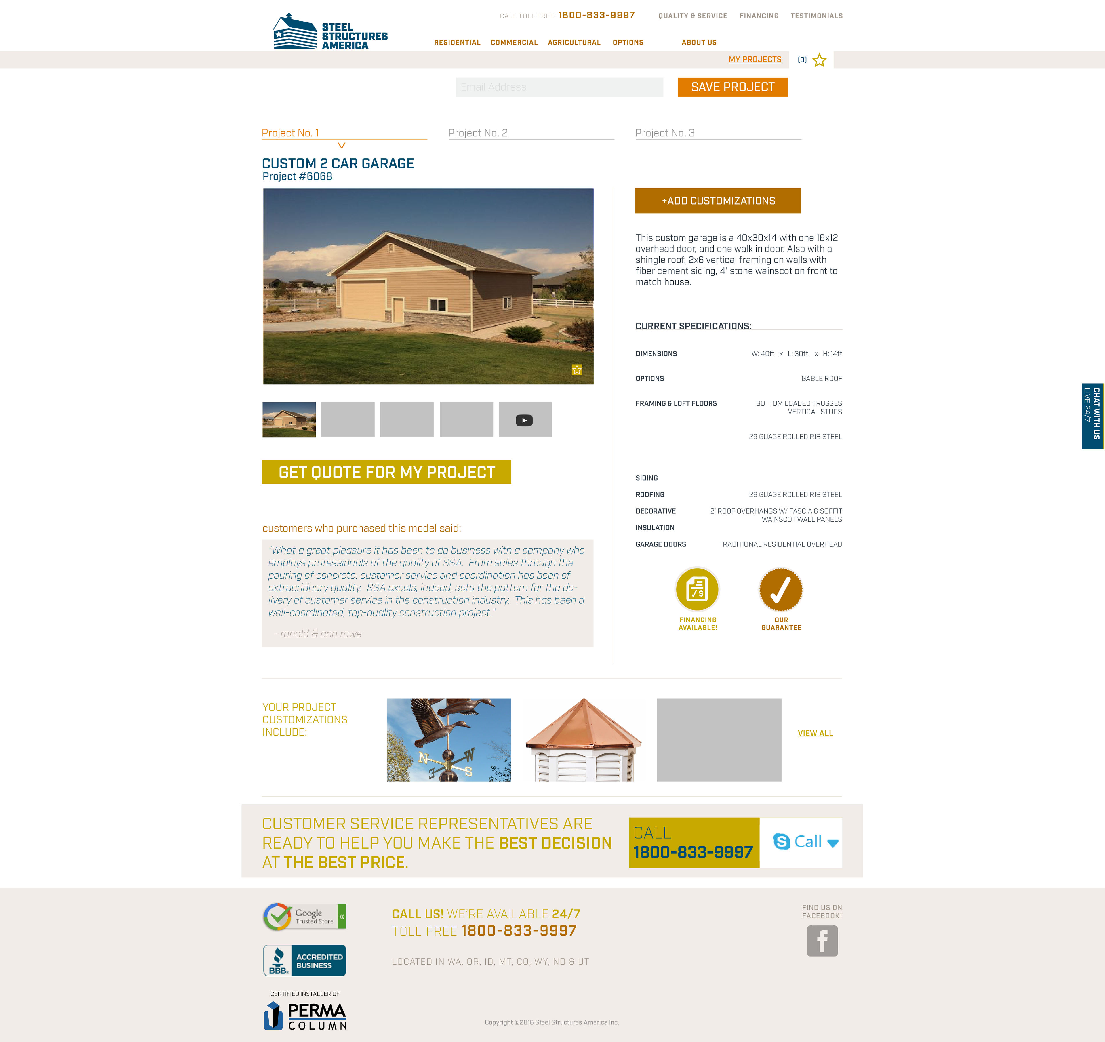
My projects page design.
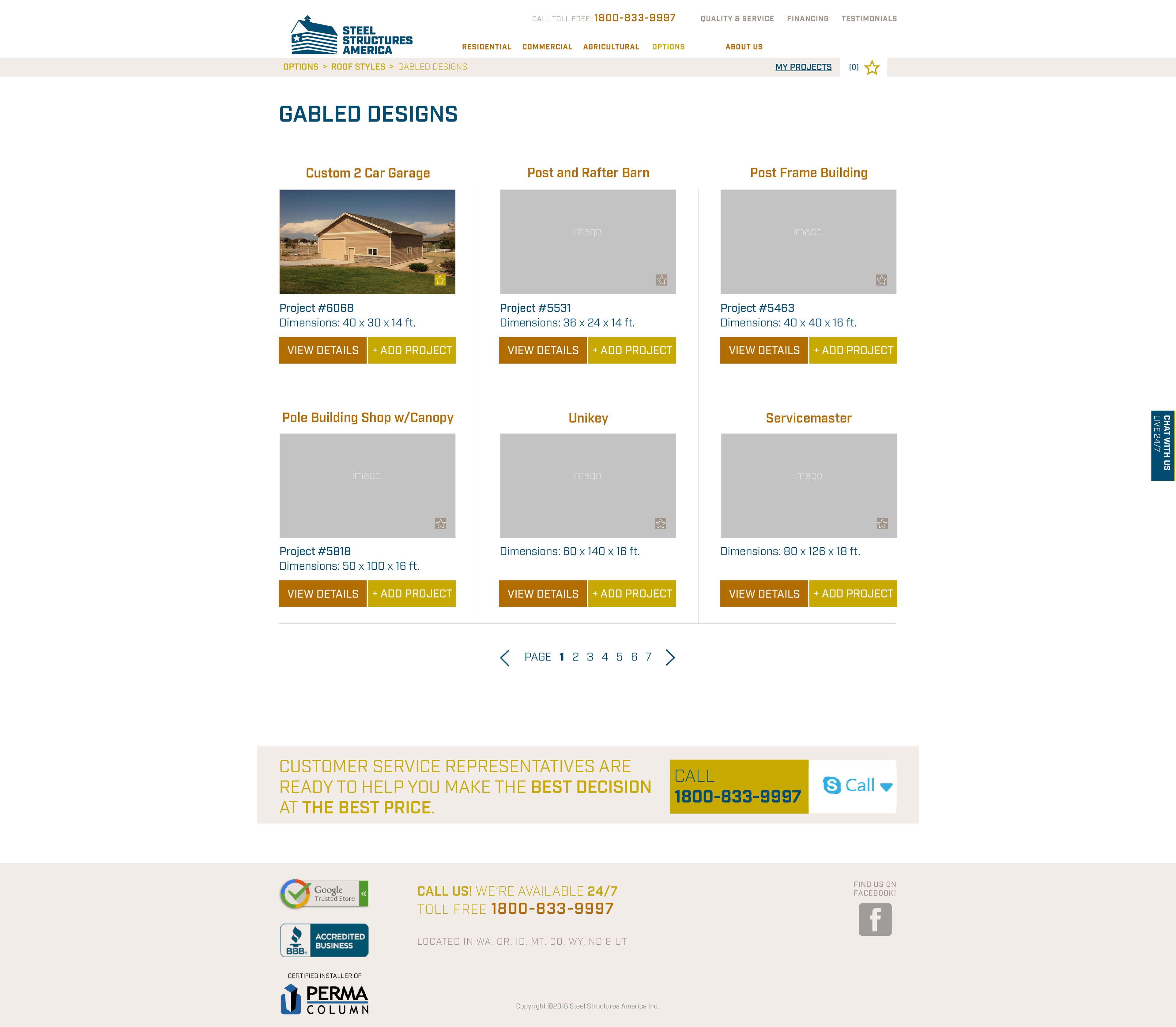
Options sub page design.
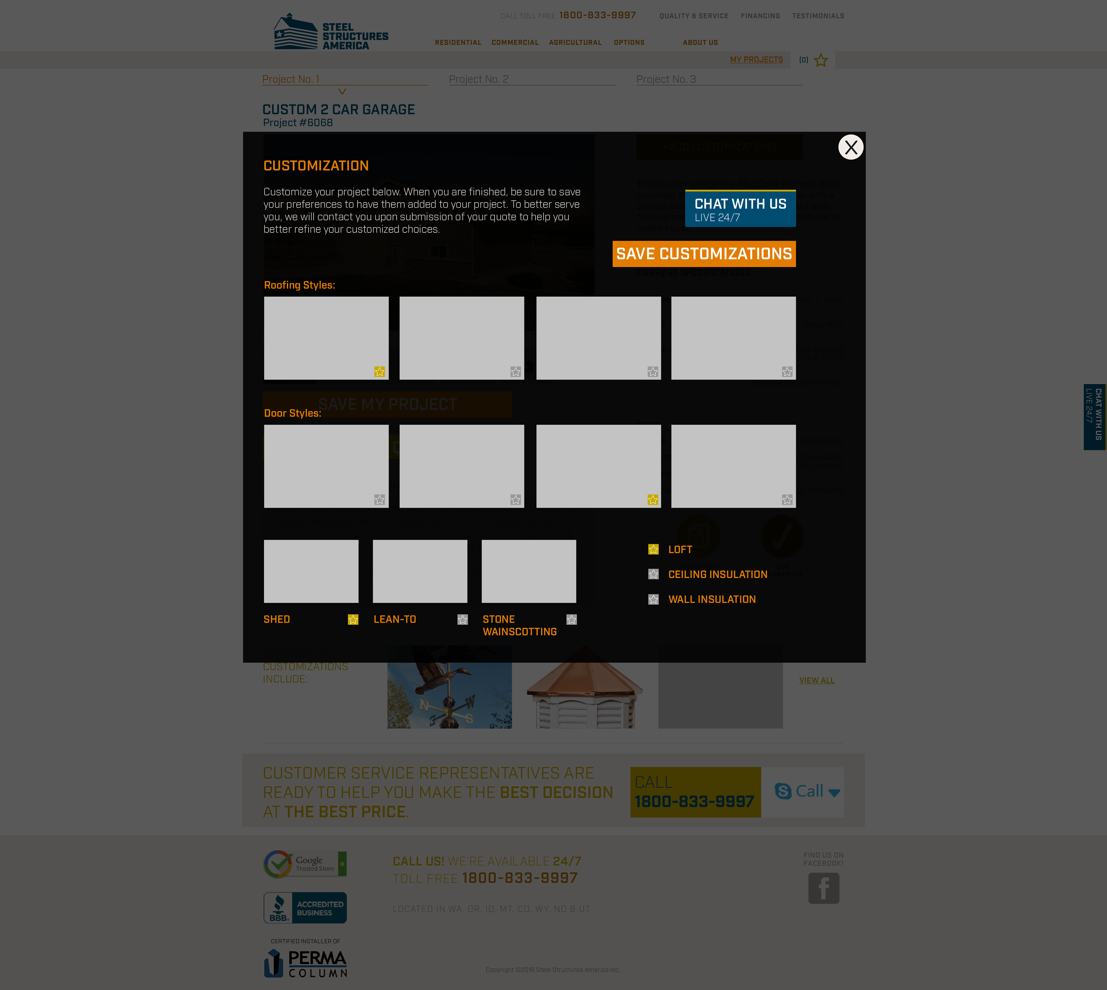
My projects modal design.
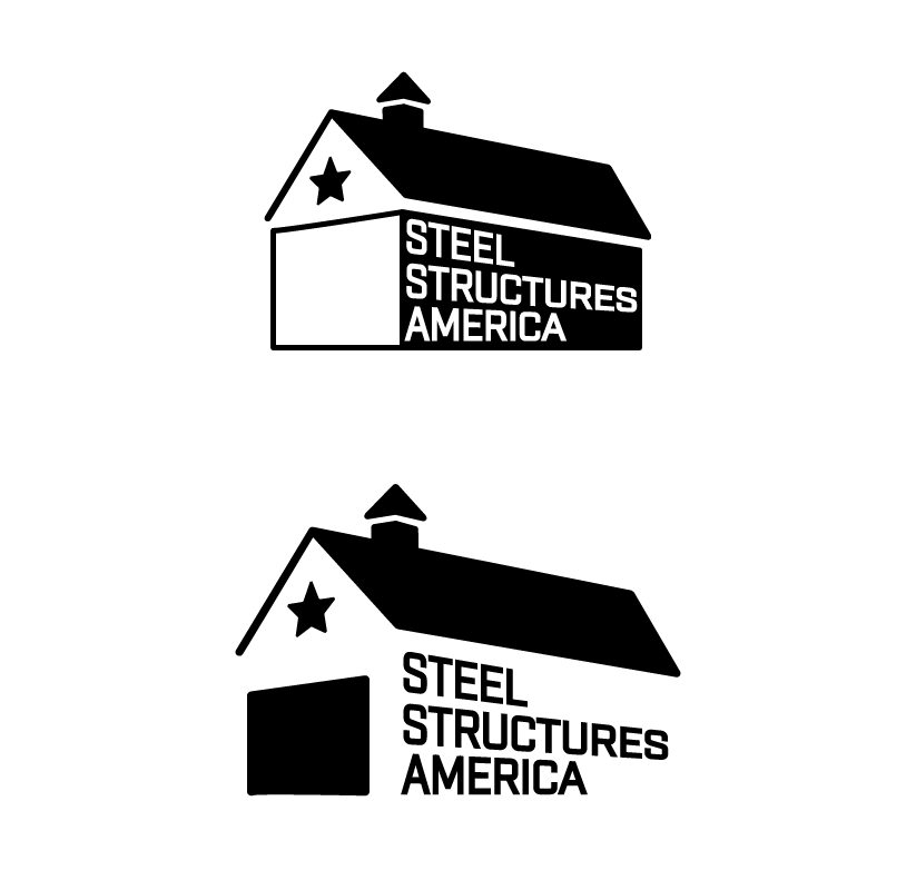
Proposed logo options.
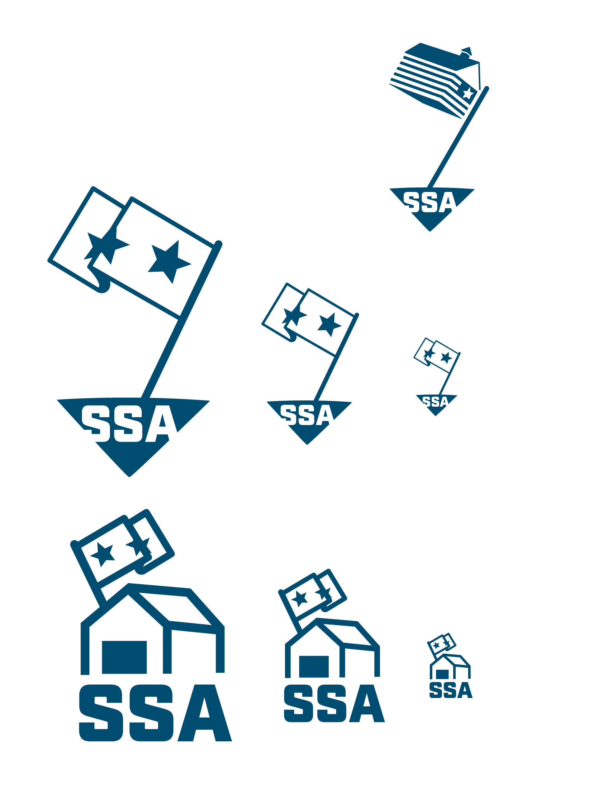
(Including a funny one!)
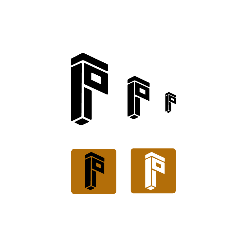
Proposed logo design for Perma-Column, an SSA partner company.